
Designing the OTP Entry Screen
The message is only half the job. Here is how to design the OTP entry screen: input field, autofill, paste, resend timers, and error states that convert.
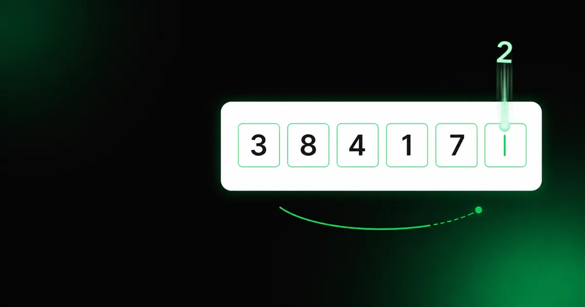
You spent real effort on the verification message: a clean sender, a tight template, autofill hooks. Then the user taps back into your app and hits the screen where they actually type the code. That screen is where verification is won or lost. A great message delivered to a clumsy input still loses users.
Here is how to design the entry screen so the code the user already received turns into an approved verification.
The input field
The single most common mistake is fighting the platform. You do not need a row of six separate boxes with custom focus-jumping logic. That pattern looks tidy in a mockup and breaks autofill, paste, and screen readers in practice.
Prefer one input that accepts the whole code, with three attributes set:
inputmode="numeric"so mobile keyboards open on digits, not letters.autocomplete="one-time-code"so the OS can offer the code it just saw.pattern="[0-9]*"as a fallback hint for older browsers.
If you want the segmented look, render the boxes as a visual layer over a single real input, so the browser still sees one field. The rule is simple: never make the user (or the OS) work harder than typing six digits into one place.
Autofill is the shortest path to approved
The fastest verification is the one the user never types. On the web, an input with
autocomplete="one-time-code" lets iOS Safari surface the code from the incoming
SMS as a QuickType suggestion. On native, the levers are the SMS Retriever API and
Autofill on Android, and the AutoFill framework on iOS. These depend on how the
message is formatted, which is why the message and the screen have to be designed
together: the entry field advertises that it wants a one-time code, and the message
is shaped so the OS can find one.
When autofill works, most users approve in a single tap. Treat it as the primary path, not a nice-to-have, and test it on real devices before launch.
Paste has to just work
Some users copy the code from a notification or another app. If your six-box widget
only accepts one character per box, a paste of 123456 lands in the first box and
the rest are dropped. A single input handles paste for free. If you keep the
segmented look, make sure a paste event fills every box, not just the focused one.
Resend: a timer, not a spammable button
When the code does not arrive, users want to resend. Two things matter here, and both come straight from how the API behaves.
First, resend does not retry the same channel; it advances to the next one.
POST /otp/resend moves the same OTP to the next channel in your routing order, so
the button copy should promise a new attempt, not a duplicate. “Resend code” is fine;
“Send the same SMS again” is wrong. One caveat: if the first channel is WhatsApp, the
send returns a wa.me link the user taps to receive the code over chat, then enters it
in the same input as any other channel.
Second, there is a cooldown. Calling resend too soon returns 429, and the
fallback chain is finite: when there is no further channel, resend returns 409.
Reflect both in the UI:
- Disable the resend button and show a countdown (
Resend in 0:23) so the user cannot hammer it into a429. - Once the chain is exhausted, stop offering resend and switch to an escape hatch: “Still stuck? Try a different method” leading to email or support.
Error and expiry states
A wrong code does not fail the verification immediately. The user gets a few
attempts; only when they run out does the OTP move to failed. Independently, every
code expires after its lifetime, at which point the status becomes expired even if
attempts remain. Your screen needs to speak both languages:
- Wrong code, attempts left: clear the field, keep the user on the screen, and say what happened (“That code doesn’t match. Try again.”). Do not reveal how many attempts remain to a potential attacker, but do reassure a fumbling human.
- Attempts exhausted (
failed) or timed out (expired): the code is dead. The only way forward is a freshPOST /otp/send. Say so plainly (“That code expired. We sent a new one.”) and reset the timer.
Because the API never returns the code itself, your screen can never “check” the
code client-side. Every guess is a POST /otp/verify round trip, which is exactly
why the states above, not client validation, are your real UX surface.
Accessibility and the small stuff
- Label the field (“Enter the 6-digit code”), do not rely on a placeholder that vanishes on focus.
- Autofocus the input on screen load so the keyboard is already up.
- Announce errors with
aria-liveso screen-reader users hear the retry prompt. - Show the masked recipient the API returns (
+1****71) so the user knows which number the code went to, especially after a channel fallback.
The checklist
- One real input,
inputmode="numeric",autocomplete="one-time-code". - Autofill tested on a real iPhone and a real Android device.
- Paste fills the whole code.
- Resend is a disabled-with-countdown button, retired when the chain is exhausted.
- Distinct copy for wrong-but-retryable,
failed, andexpired. - Field labelled, autofocused, and errors announced.
Get the message right and the screen right, and the six digits between “send” and “approved” stop being a place users drop off.